
Delaware Depository
Brochure Design
Branding & Messaging Contributions
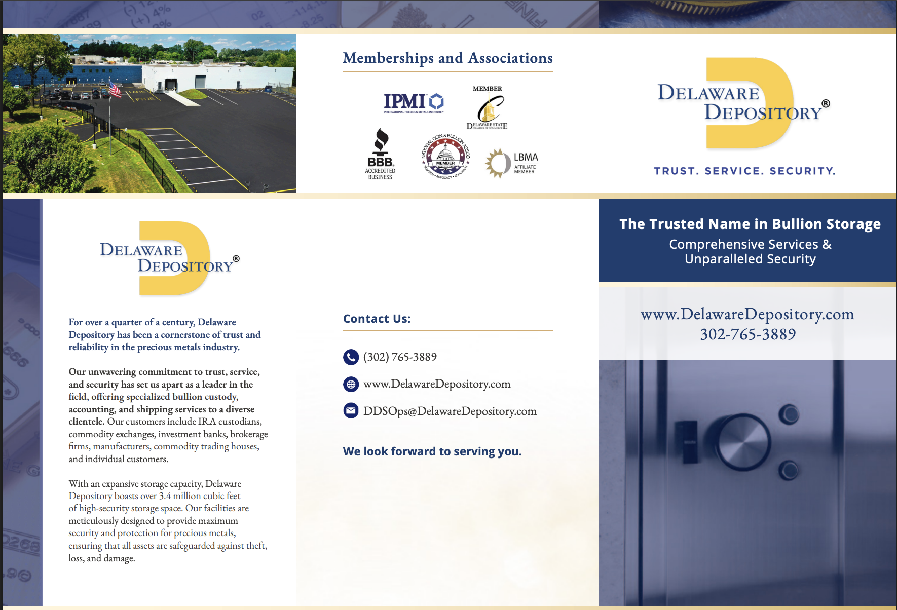
Refreshed Visual Identity
Aligned design with updated brand standards, including consistent use of the signature yellow "D" icon, blue-gold color palette, and strong typographic hierarchy to convey professionalism and security.Refined Value Proposition Messaging
Crafted clear, reader-friendly language to emphasize Delaware Depository’s core differentiators:Unparalleled security (24/7 surveillance, internal audits, secure comms)
Global storage options (U.S., Canada, Switzerland)
Trustworthy compliance (CME & NYMEX approval, IRS regulations)
Client-centric service (IRA, mutual fund, and institutional support)
Role:
Branding, Design, Messaging
Position:
Digital Experience + Marketing Administrator
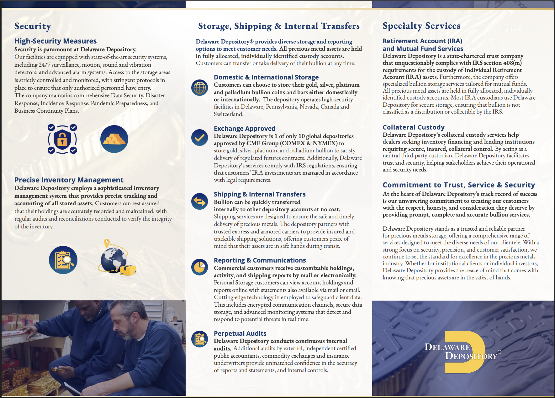
Improved Readability & Flow
Reorganized brochure sections to prioritize user needs—starting with trust and security, followed by storage logistics, and ending with specialty services and audit credibility.
Elevated Credibility
Integrated trust signals like membership logos (IPMI, BBB, LBMA) and regulatory affiliations to reinforce legitimacy for institutional and individual investors.